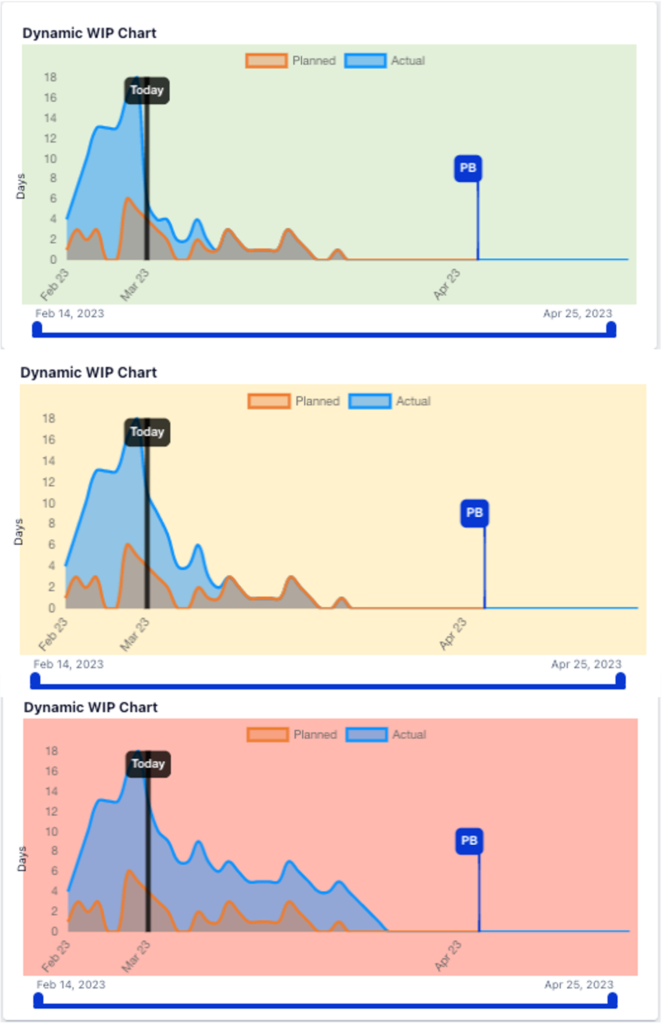
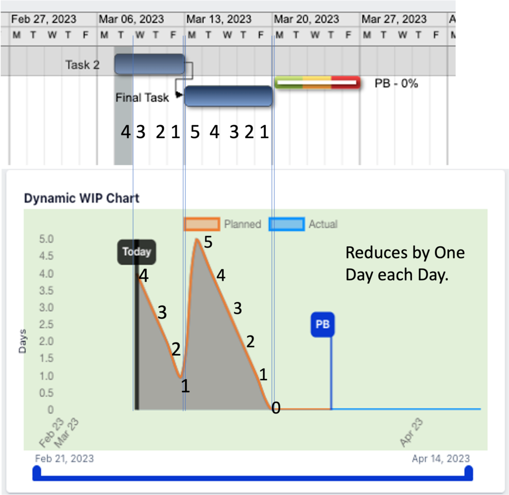
Displays Planned Task Work In Process (WIP) days vs. Projected (Actual) Task Work In Process (WIP).
Is a dynamic Leading Indicator displaying the daily Work In Progress (WIP)… The WIP Chart Curves display Past and Predicted Performance.
The Portfolio Dashboard displays the aggregate Project WIP, and the Project Dashboard displays individual Project WIP.
Only projects with Started status display and not projects in Pipeline status.
Note: In manufacturing environments, when a work order is released to production, the entire Order is considered WIP.
Daily Task Updating ensures Exepron displays real-time Intelligence for realistic and practical Decision-Making.
The Projected and Planned areas under the WIP Chart curves display today’s Work in Progress (WIP) and the expected future Workload.
Disruption to the WorkFlow will elevate the Projected remaining Work Flow (blue color) above the original Planned Work Flow (orange color).
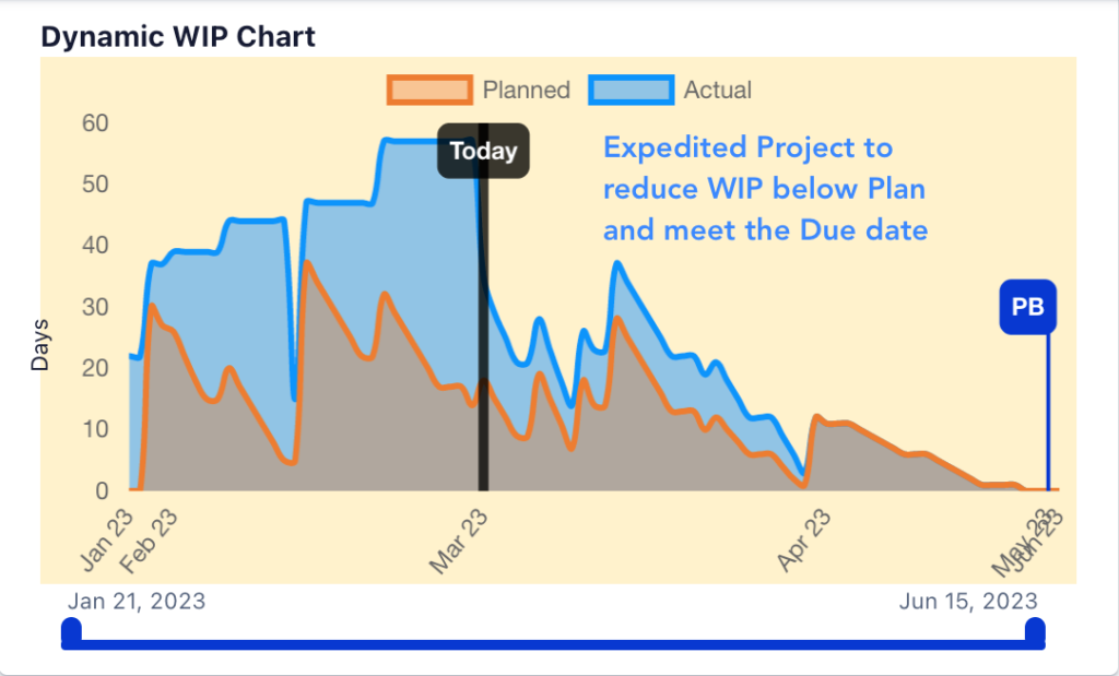
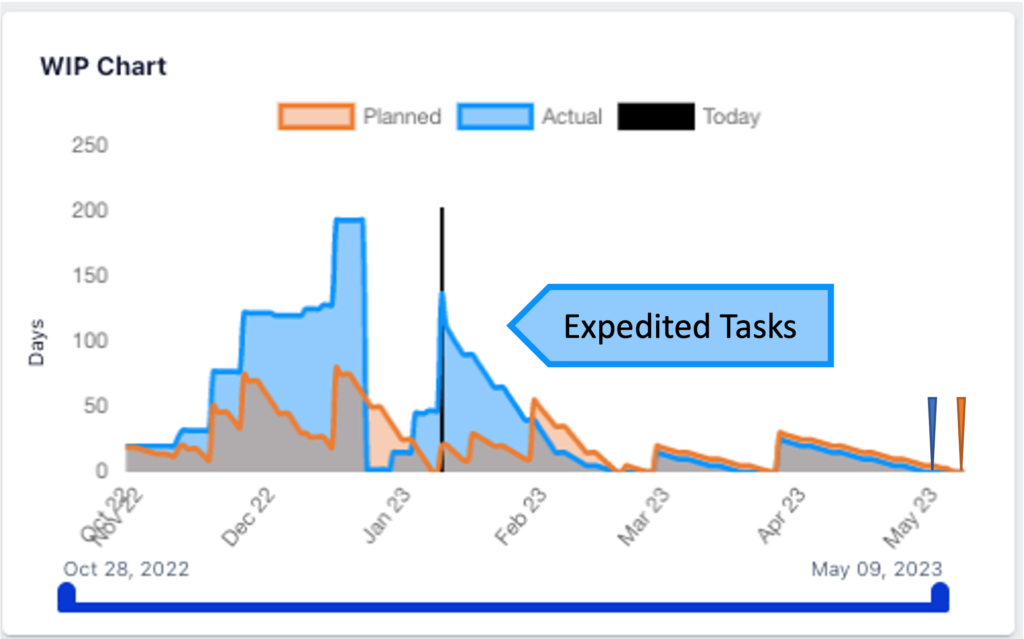
Example 1. displays the history of delayed project updates and then expedited to maintain the Due Date.
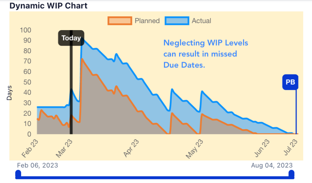
Example 2. Displays the future expected WIP and missed Due Date caused by ignoring updating or a significant delay.
Purpose: For a performance review of the daily dynamic Increase and Decrease of Work In Progress (WIP).
If the Area of ProjectedWIP is higher than the Planned WIP, and the expected Due Date is Shorter than Planned, this would indicate expedited Tasks and ‘pulling work forward in time. When expediting, users should avoid Multi-Tasking resulting from Resource Overloading.
If the Area of the Projected WIP is higher than the Planned WIP and the Expected Due Date is greater than the Planned Due date. There is a significant delay in Daily Task Updating or Tasks are updated, but actual Task delays are more significant than the Planned Duration.
Interpretation: If the Area of the Projected WIP curve is lower than the Planned WIP curve, then the Project Performance is tracking ahead of the Planned WIP. To the right of Today’s line is the display of the Predicted WIP.
Application: To interpret the chart effectively, Daily Task Updating is required to ensure real and relevant data. During project execution, any update to Task Duration will either be a Gain or a Delay that dynamically moves the Projected display area.
Decreased Task Duration will contract the Projected curve, while Delays in Task Durations or neglected Task updating elevate and expand the Actual display area.
Expediting dependency Chain Tasks may elevate the WIP while Maintaining or Finishing before the planned Due Date.
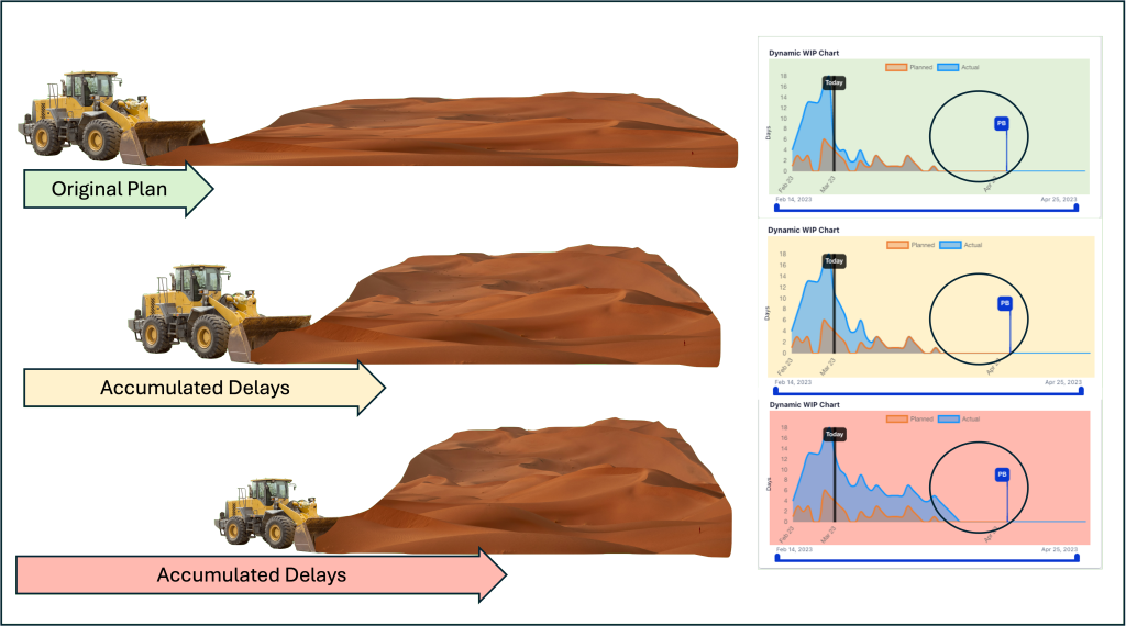
The Dynamic WIP Chart background colors follow the Statistical Process Control (SPC) Chart convention, having an upper control limit.
Green: Projected WIP is under the Upper Control Limit (UCL), and the project is in Control.
Yellow: Projected WIP is approaching the Upper Control Limit (LCL), a warning that Control might be lost.
Red: Projected WIP has exceeded the Upper Control Limit (UCL); consider the project out of Control.
