Business Intelligence Support System
Real-time, critical business intelligence for Senior Management
24 / 7 providing Project and Portfolio progress and performance assessment.
BIDSS provides real-time intelligence of both past and current performance. The Project Risk Quotient displays a future view of the relative level of execution Risk for each Project or the Portfolio of Projects. Cash-Flows and ROI are tracked with each Task update. BIDSS intelligence responds dynamically to gains or delays. Users can select the entire portfolio, Groups of Projects, or individual Projects for in-depth critical analysis and decision-making.
Charts include:
- Performance Metrics, monitoring trends, and past performance.
- Compliance Metrics, displaying the current status of key metrics.
- Actionable, Cause and Effect Metrics, Predictive, Forward View for comparative;
Plan vs. Actual, Past vs. Future, and deeper analysis. - Financial Performance and Risk Metrics to manage Cash Flows, Schedule Risk Management, ROI, and Budgets.
The Intelligence is displayed on dashboard Charts, with a real-time display at each Task update. Executives, Managers, the PMO, and Program Managers remain fully informed at all times with a single glance.
Three main categories are displayed on three separate tabs:
Schedule Performance, Financial Performance, and Risk Profile.
Note: To populate BIDSS with Finacial Data, Users must enter Resource Type, Work Hours and Rates, and Task Revenue on project Tasks before this information can be included in the BIDSS Charts.
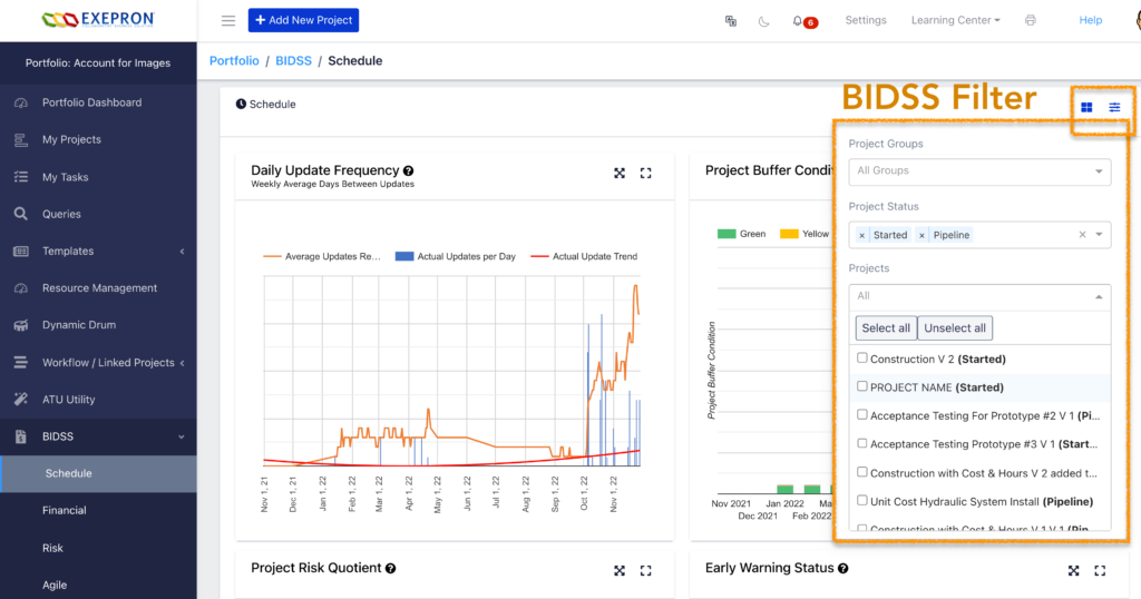
Users can select the Projects they wish to include in the analysis using the BIDSS Filter. The default display is a consolidation of projects in the Charts.

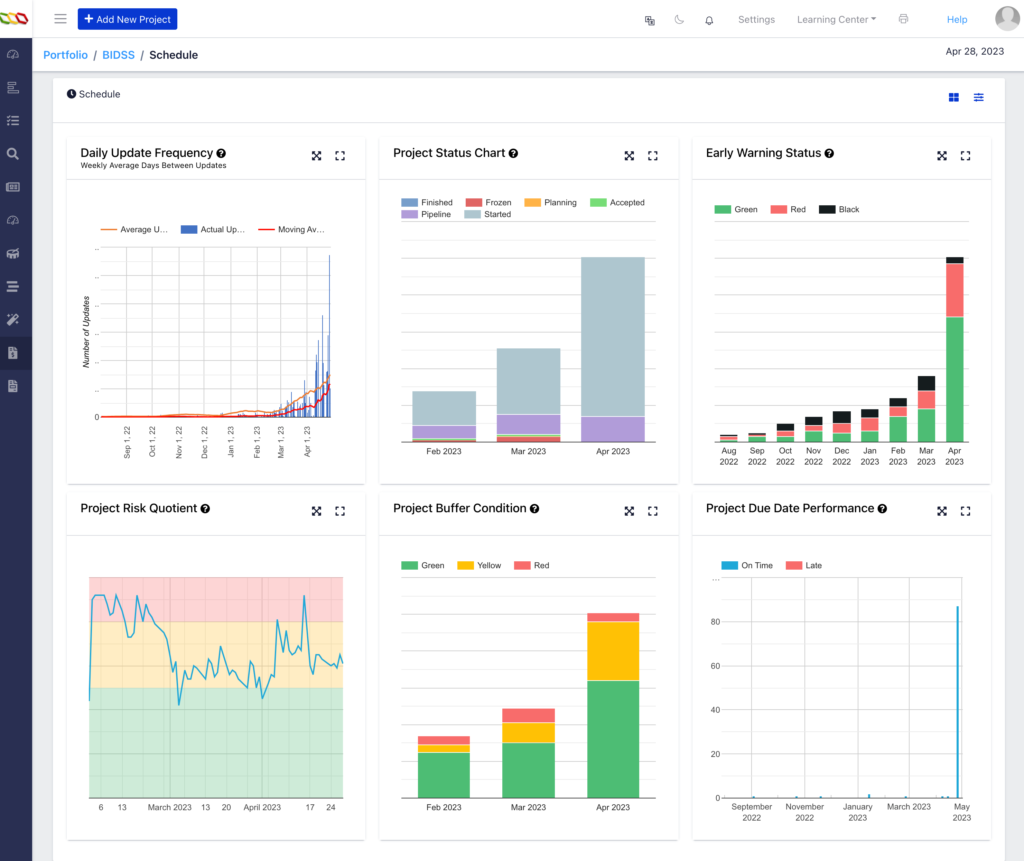
The following Charts display Portfolio Level Information and do not change with individual project selection.
Project Status Chart, Project Buffer Condition, Early Warning Status, Project Due Date Performance, and the Project Workflow. Clicking any Chart Title will expand the chart into a Presentation View.
Schedule Performance Tab.

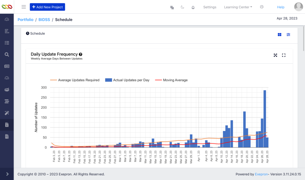
The Daily Update Frequency Chart: Figure 1.
Daily Task updating, including Remaining Duration, Notes, and Reason Codes updating, is required to ensure the displayed information has any value for decision-making.
Delays in Task updates will provide old information, and the displayed numbers and charts will provide outdated intelligence. The quality of decision-making improves exponentially with update high frequency and by a wide span and depth of resources entering data. In essence, is the BIDSS intelligence real-time and worth reviewing for decision-making?
Management should insist on the Best Practice of Daily Task Updating on all active Tasks.

Fig 1.
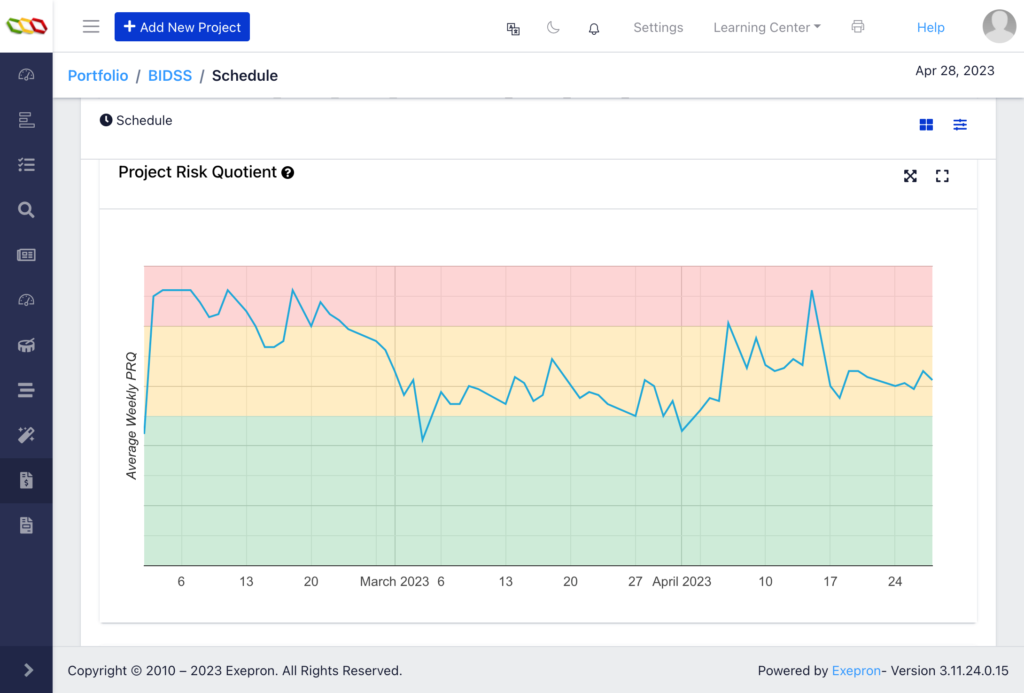
Project Risk Quotient Chart: Figure 2.
The trend of the average PRQ of selected projects or the entire Portfolio. The PRQ chart provides an index of Schedule Risk based on current Resource Loading and remaining Protective Capacity. During Execution, the PRQ displays the Execution risk of the schedule. Figure 2.

Fig. 2
Status Chart:
Displays the status and number of projects at the end of each month. Figure 3.
Fig. 3
Project Buffer Condition:
Figure 5.
Displays the number of Started and Pipeline projects with their Project Buffers: Green, Yellow, or Red at the end of the month.
The current month displays the month-to-date.
A healthy profile would have the majority in Green or Yellow and a few in Red. Figure 4.
Fig. 4
Early Warning Status:
Figure 5.
Displays the number of Started and Pipeline projects with the Early Warning in the Green, Red or Black status at the end of the month. A healthy profile would have the majority in Green, a few in Red, and No projects in Black. Figure 6
Fig. 5
Performance: Number of Projects Early / Late:
Displays the number of projects finishing on time or late. On-time: on or before the date at the end of the Project Buffer. Late: after the planned Due Date at the Project Buffer’s end. A healthy profile would have 90% Blue and 10% Red. Status is recorded as “Started” in the BIDSS dropdown until the Project is officially changed to “Finished.” Figure 6.
Fig. 6
Financial Performance Tab.
Projects Margin Estimate:
Displays each Tasks Revenues and Costs as positive numbers above the chart zero line.
Actual Revenues and Costs display a gray vertical bar to the left of Today’s date.
Planned Revenues and Costs display a gray vertical bar to the right of Today’s date.
The Project Cumulative Net Income (Cumulative Revenue less Cumulative Costs) is displayed as the Margin Estimate for the Portfolio or the projects selected in the dropdown menu.
The Orange line should be above the line for a healthy cash flow estimate. Figure 7.
Fig. 7
Projects Cumulative Cost and Revenue:
Displays the cumulative Revenue and cumulative Cost:
Actual Revenues and Costs display a gray vertical bar to the left of Today’s date. Figure
Planned Revenues and Costs display a gray vertical bar to the right of Today’s date. Figure 8.
Fig. 8
Projects Cumulative Cost and Revenue: ROI; Revenue; Costs:
Displays the cumulative Revenues and cumulative Costs, including the Project Return On Investment (ROI).
Cumulative Net Income (Cumulative Revenue less Cumulative Costs)
Project ROI = cumulative Net Income divided by cumulative Costs.
Actual displays to the left of Today’s date gray vertical bar.
Planned displays to the right of Today’s date gray vertical bar. Figure 9.
Fig. 9
Projects Cumulative Actual Revenue and Cumulative Planned Revenue:
Displays the cumulative Actual and cumulative Planned Revenue.
Actual Revenues display to the left of Today’s date gray vertical bar.
Planned Revenues display to the right of Today’s date gray vertical bar. Figure 10.
Fig 10.
Projects Cumulative Actual Costs and cumulative Planned Costs:
Displays the cumulative Actual Costs and the cumulative Planned Costs.
Actual Costs display to the left of Today’s date gray vertical bar.
Planned Costs display to the right of Today’s date gray vertical bar. Figure 11.
Fig. 11
Risk Profile Tab.
Early Warning Status:
Displays the number of Started and Pipeline projects with the Early Warning in the Green, Red, or Black status at the end of the month. Figure 12.
Fig.12
Actual Cumulative Net Income Vs. Planned Cumulative Planned Net Income:
Displays the cumulative Net Income.
Actual displays to the left of Today’s date gray vertical bar.
Planned displays to the right of Today’s date gray vertical bar. Figure 13.
Fig 13.
Resource Loading Exceeding 100%:
Displays the dynamic Resource Loading % for Resource Types predicted to exceed 100% Loading. Figure 15.
Fig 15.
Agile Chart Tab
Burn Down Chart
Displays the rate at which the ‘accumulation” of Actual Task Days completed tracks against the Planned Task Days completed. The green zone is the Planned Days. The purple line is the accumulated Actual Days completed. If the purple is above the line, the Actual completed during execution is tracking behind Planned completed days.
This example displays the accumulation of Actually completed Task Days tracking ahaed pf Plan and then tracking behind the Planned Task Days for the selected project statuses: Started; Archived; and Finished.

Burn Up Chart
Displays the accumulated Remaining Duration Task Days compared to the accumulated Planned Task Remaining Duration Days. The dotted line on the chart displays a 15% tollerance on either side of the plan.
This Example shows the Actual Remaining Duration is ahead of the Planned Remaining Duration and then Behind the Planned Task days for the selected set of project statuses: Started; Archived; and Finished.

Control Chart
Displays an analysis of your team’s productive performance.
Measuring the effect of any process change of your team’s productivity, displaying cycle time vs. quality time for your project. The rolling average average actual time vs. standard deviation for this time period.
The blue shading represents the moving standard deviation, the narrower the blue band, the more confident you can be in the future prediction of the cycle time.

We suggest only using the control chart for smaller groups of projects or individual projects. Large quantities of data become less meaningful with this chart.


